
 Arizona Cardinals
 Atlanta Falcons
 Carolina Panthers
 Chicago Bears
 Dallas Cowboys
 Detroit Lions
 Green Bay Packers
 Los Angeles Rams
 Minnesota Vikings
 New Orleans Saints
 New York Giants
 Philadelphia Eagles
 San Francisco 49ers
 Seattle Seahawks
 Tampa Bay Buccaneers
 Washington Commanders
 Baltimore Ravens
 Buffalo Bills
 Cincinnati Bengals
 Cleveland Browns
 Denver Broncos
 Houston Texans
 Indianapolis Colts
 Jacksonville Jaguars
 Kansas City Chiefs
 Las Vegas Raiders
 Los Angeles Chargers
 Miami Dolphins
 New England Patriots
 New York Jets
 Pittsburgh Steelers
 Tennessee Titans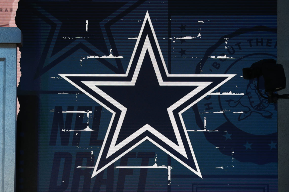


The Lone Star State team is one of the most historical and successful teams in all of the NFL and have adopted and persisted with a blue star since their birth.
Founded under the name Dallas Cowboys in 1960, majority investor Clint Murchison Jr., unbeknown to him, had set the wheels in motion for the most supported team in the NFL to date.
Cowboys logo heritage
The Cowboys heritage is something to be admired: securing five world titles, 10 Conference Championships, 24 division titles and appearing in the playoffs on 35 occasions. Success has dried up in recent years with failures to secure world titles and appearances in the NFC Championship games.
Initially, in 1960, the Dallas Cowboys logo started as a five-pointed star with a colour filler of dark blue. To maintain the franchise’s history, the crest has seen very minor changes up until 2024.
The logo which most Cowboys and NFL fans are familiar with was created in 1964. A small modification was made to the logo by Jack Escridge, who added a white contour to the blue star’s border – creating an aesthetic 3D appearance. Traditionally, the star holds a representation and relevant connotations to the state of Texas – being known as the ‘Lone Star’.
Since the logo’s inception, blue has always been the iconic colour and has not been altered. Moreover, blue is a popular colour and for good reason: excellence, power, perseverance, purity, strength and integrity are all resounding words which are all commonly associated.

Milestone events
Although, for special milestone events in the Cowboys history, anniversary emblems have been designed which have strayed away from the original concept.
When celebrating the franchise’s 25th anniversary, an all-silver design with three smaller stars and the words ‘silver season’ were depicted around the name Dallas Cowboys.
A design to mark the 40th anniversary stayed truer to the original: the navy-blue star was cemented on a circular grey border, wrapped in a silver ribbon and various inscriptions were visible.
The franchise has shown no urgent indication of changing the logo drastically any time soon.